Excel Business Dashboard Template: How to Build Financial KPI Dashboards
CFOs and finance managers track an average of 5-20 KPIs, but most spend hours manually updating spreadsheets instead of analyzing the numbers (Vena Solutions, 2025). An Excel business dashboard template solves this by consolidating your key financial metrics into a single view that updates automatically when you enter new data.
This guide shows you how to build a financial KPI dashboard in Excel from scratch — or skip the construction and download our ready-made FP&A dashboard template. Either way, you'll have a dashboard your CFO can actually use within a day.
Key Takeaways
- Track 5-7 KPIs that directly connect to business decisions — more creates noise, fewer misses context
- Structure your Excel file in 3 layers: raw data input, calculation logic, and visual dashboard output
- The 15 most important financial KPIs fall into 4 categories: profitability, liquidity, efficiency, and growth
- Download our financial KPI dashboard template (free) or FP&A dashboard suite to start immediately
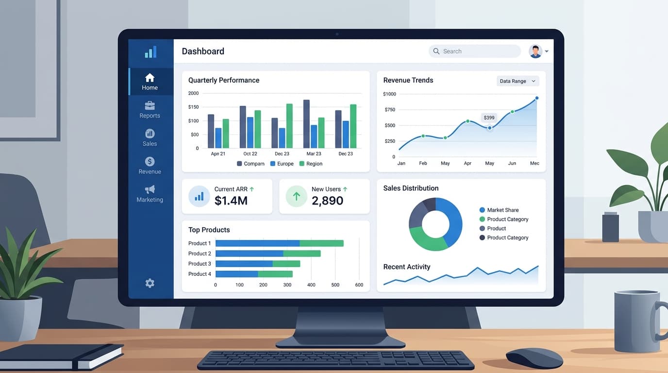
What Should an Excel Business Dashboard Include?
A financial dashboard isn't a collection of charts — it's an answer to the question "how is the business performing right now?" The best dashboards follow the IBCS (International Business Communication Standards) principle: show the current value, the target, the variance, and the trend for each metric (Sheetgo, 2026).
Here's the framework for a dashboard that CFOs actually use:
Top section — Executive KPI cards (5-7 metrics): Each card shows the metric name, current value, target, variance ($ and %), and a trend indicator (up/down/flat). These are the numbers your CEO reads in 10 seconds.
Middle section — Charts (3-4 visualizations): Revenue trend (line chart), expense breakdown (bar chart), budget vs. actual (grouped bar), and cash position (area chart). Choose chart types that match the data story — don't use pie charts for time-series data.
Bottom section — Detail tables: Monthly breakdown, department-level drill-down, and year-over-year comparison. This is where the analysis happens when a KPI card shows a red variance.
The 15 Financial KPIs Every Dashboard Needs
Not every business tracks the same KPIs, but these 15 cover the fundamentals across four categories. Pick 5-7 that matter most to your business model.
Profitability Metrics
| KPI | Formula | Benchmark |
|---|---|---|
| Gross Margin | (Revenue - COGS) / Revenue | 40-60% (SaaS: 70-80%) |
| Net Profit Margin | Net Income / Revenue | 10-20% |
| EBITDA Margin | EBITDA / Revenue | 15-25% |
| Operating Margin | Operating Income / Revenue | 10-20% |
Liquidity Metrics
| KPI | Formula | Benchmark |
|---|---|---|
| Current Ratio | Current Assets / Current Liabilities | 1.5-3.0 |
| Quick Ratio | (Cash + Receivables) / Current Liabilities | 1.0-2.0 |
| Cash Runway | Cash Balance / Monthly Burn Rate | 12+ months |
Efficiency Metrics
| KPI | Formula | Benchmark |
|---|---|---|
| Days Sales Outstanding (DSO) | (Receivables / Revenue) × 365 | 30-45 days |
| Inventory Turnover | COGS / Average Inventory | 5-10x (industry-dependent) |
| Revenue per Employee | Total Revenue / FTE Count | $150K-$300K |
| CAC Payback Period | CAC / Monthly Revenue per Customer | < 12 months |
Growth Metrics
| KPI | Formula | Benchmark |
|---|---|---|
| Revenue Growth Rate | (Current - Prior) / Prior × 100 | 10-30% YoY |
| MRR / ARR Growth | Monthly or Annual Recurring Revenue trend | 20%+ for SaaS |
| Customer Retention Rate | Retained Customers / Start Customers × 100 | 85-95% |
| Burn Rate | Monthly Cash Outflow | Declining toward breakeven |
For a template that tracks all 15 with built-in formulas and conditional formatting, download our financial KPI dashboard — it's free.
How to Build an Excel Dashboard: Step-by-Step
Step 1: Set Up the 3-Layer File Structure
The single biggest mistake in Excel dashboards is mixing data, calculations, and visuals on one sheet. Separate them into three layers:
Sheet 1 — "Data Input": This is where raw numbers go. Monthly revenue, expenses by category, headcount, cash balances. Use a clean table format with months as columns and categories as rows. No formulas here — just data.
Sheet 2 — "Calculations": All your KPI formulas live here. SUMIFS, INDEX/MATCH, IF statements — everything that transforms raw data into metrics. This sheet is the engine. Nobody needs to see it except you.
Sheet 3 — "Dashboard": The visual output. KPI cards, charts, and summary tables. Everything references the Calculations sheet — never the raw data directly. This is the sheet you share with the CFO.
This separation keeps your dashboard maintainable. When next month's data arrives, you update Sheet 1 and everything else refreshes automatically.
Step 2: Build Your Data Input Table
Create a standardized input table that's easy to update monthly:
| Category | Jan | Feb | Mar | Apr | May | Jun |
|---|---|---|---|---|---|---|
| Revenue | $450,000 | $472,000 | $495,000 | $488,000 | $510,000 | $535,000 |
| COGS | $180,000 | $186,000 | $193,000 | $195,000 | $198,000 | $205,000 |
| Personnel | $145,000 | $145,000 | $148,000 | $148,000 | $152,000 | $152,000 |
| Software | $22,000 | $22,000 | $22,000 | $24,000 | $24,000 | $24,000 |
| Marketing | $35,000 | $38,000 | $42,000 | $40,000 | $45,000 | $48,000 |
| Other OpEx | $28,000 | $26,000 | $30,000 | $27,000 | $29,000 | $32,000 |
| Headcount | 85 | 87 | 89 | 89 | 92 | 94 |
| Cash Balance | $1,200,000 | $1,255,000 | $1,307,000 | $1,351,000 | $1,412,000 | $1,486,000 |
Use Excel's Format as Table feature (Ctrl+T) for automatic expansion and structured references.
Step 3: Create the Calculations Layer
For each KPI, write a formula that references the data input sheet:
Gross Margin = (Revenue - COGS) / Revenue
= (DataInput!B2 - DataInput!B3) / DataInput!B2
Use named ranges for readability. Instead of DataInput!B2, create a named range called Revenue_Jan so your formulas read like English: =(Revenue_Jan - COGS_Jan) / Revenue_Jan.
Build a summary table that calculates all KPIs for the current month, prior month, YTD, and prior year:
| KPI | Current Month | Prior Month | Change | YTD | Target | Variance |
|---|---|---|---|---|---|---|
| Gross Margin | 61.7% | 61.2% | +0.5% | 60.8% | 62.0% | -1.2% |
| Net Margin | 14.2% | 13.8% | +0.4% | 13.5% | 15.0% | -1.5% |
| Revenue Growth | +4.9% | +4.5% | +0.4% | +18.9% | +20.0% | -1.1% |
| DSO | 38 days | 41 days | -3 days | 39 days | 35 days | +4 days |
Step 4: Design the Visual Dashboard
Keep the dashboard to a single screen — no scrolling. Use these Excel features:
- KPI cards — Merge cells to create card-like blocks. Use conditional formatting to turn the variance green (favorable) or red (unfavorable)
- Sparklines — Mini charts inside cells that show 6-12 month trends without taking up space
- Bar charts — Budget vs. actual comparison by category
- Line charts — Revenue and margin trends over 12 months
Avoid pie charts for financial data — they're hard to read when slices are similar sizes. Use horizontal bar charts instead, which allow easy comparison across categories.
Step 5: Add Interactivity with Slicers
If your dashboard covers multiple departments or time periods, add slicers (Insert → Slicer) connected to your data table. This lets users filter the entire dashboard with a single click — no formulas to update.
Common slicers for financial dashboards:
- Time period — MTD, QTD, YTD, trailing 12 months
- Department — Engineering, Sales, Marketing, Operations
- Region — if you operate in multiple locations
- Scenario — Budget, Forecast, Actual
Common Dashboard Mistakes to Avoid
-
Too many KPIs — If your dashboard has 20+ metrics, nobody reads any of them. Five to seven is the sweet spot for executive dashboards. Put detail metrics in a separate tab.
-
No variance explanation — Showing that marketing is 15% over budget isn't useful without context. Add a comments column or callout box explaining WHY the variance exists and what action is being taken.
-
Static data — If updating the dashboard takes more than 15 minutes per month, the structure is wrong. Data entry should happen in one place (Sheet 1), and everything else should calculate automatically.
-
Missing targets — A KPI without a target is just a number. Every metric needs a benchmark so the reader knows whether the result is good or bad.
-
Inconsistent formatting — Use the same number format throughout: $1.2M not $1,200,000 for large numbers, one decimal for percentages (14.2% not 14.23%). Your CFO shouldn't need to interpret different scales.
Our finding: The dashboards that get used are the ones that fit on one printed page. If you can't print it and pin it to a wall, it's too complex. Start with 5 KPIs and add more only when someone specifically asks for them.
Free Templates to Get Started
Instead of building from scratch, start with one of these templates and customize:
- Financial KPI Dashboard (Free) — 30+ KPIs across profitability, liquidity, efficiency, and leverage with monthly trend tracking
- FP&A Dashboard Suite — Multi-sheet dashboard with income statement, balance sheet, cash flow, and variance analysis
- Budget vs Actual Variance Report — 9-sheet template with revenue analysis, expense tracking, and action items
- Financial Projections Spreadsheet — 5-year projections with CAGR calculations
For a deeper dive into financial planning, see our financial planning templates guide and FP&A KPI dashboard guide.
Frequently Asked Questions
What's the best Excel version for building dashboards?
Excel 365 (Microsoft 365) is the best choice because it includes dynamic arrays (FILTER, SORT, UNIQUE), XLOOKUP, and improved charting options that older versions lack. Excel 2019 works for basic dashboards but misses dynamic array functions. Google Sheets is a solid free alternative for teams that need real-time collaboration — all the formulas in this guide work in Sheets with minor syntax adjustments.
How many KPIs should a financial dashboard have?
Between 5 and 7 for an executive-level dashboard, and up to 15-20 for a detailed finance team dashboard. The executive dashboard should answer "how are we performing?" in under 10 seconds. CFOs and finance teams typically want drill-down capability from the summary view into detailed analysis — hence the 3-layer structure with a dashboard tab, calculations tab, and raw data tab.
How often should I update my dashboard?
Monthly updates are standard for most financial dashboards. SaaS businesses with real-time revenue data may benefit from weekly MRR and churn updates. The key is consistency — if you commit to monthly updates, do them by the 5th business day of each month so the data is fresh when leadership reviews it. Automate as much as possible: connect your accounting system export directly to the Data Input sheet.
Can I connect Excel dashboards to live data sources?
Yes — Excel supports connections to SQL databases, cloud services (Azure, Salesforce), CSV/JSON feeds, and other Excel files via Power Query (Get & Transform Data). This eliminates manual data entry entirely. For cloud-based dashboards with automatic refresh, consider pairing Excel with Power BI, which shares the same calculation engine but adds scheduled refresh and sharing capabilities.
What's the difference between an Excel dashboard and Power BI?
Excel dashboards are best for small teams, simple metrics, and environments where everyone already uses Excel. Power BI is better for large datasets, real-time data connections, enterprise sharing, and interactive drill-downs. Most mid-market companies start with Excel dashboards and migrate to Power BI when they outgrow the spreadsheet — typically around 10+ data sources or 50+ users who need access.
How do I make my Excel dashboard look professional?
Remove gridlines (View → uncheck Gridlines), use a consistent color palette (2-3 colors maximum), align all chart elements to a grid, and use the same font throughout (Calibri or Segoe UI at 10-12pt). Format numbers consistently: use $1.2M instead of $1,200,000, show one decimal for percentages. Add your company logo in the top-left corner and the reporting period in the top-right. These small details signal professionalism to executives.